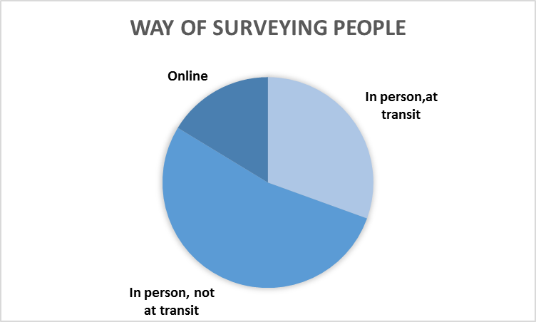
To analyze and understand a survey you first need to know how it was implemented and who was surveyed. Our main way of surveying people as shown below was to ask people in person, but to reach certain demographics we also employed online surveys. Fortunately, our community partners provided us with contacts -- connections with different companies, unions, and labor groups around the area to survey. Thanks to this assistance we were able to collect 191 surveys. You can find the complete discussion of all data analysis here : summary
|
We collected 191 surveys from different sets of people:
-Stanford service workers -Unions and labor groups -SIREN (Services, Immigrant Rights, and Education Network) -SEIU Local 521 -Transit riders -Palo Alto Caltrain station -San Jose Diridon Station -Workers in Palo Alto -Watercourse Way -Philz Coffee The second chart shows the annual income of those who answered our survey. We have a wide range of incomes, but intentionally targeted lower- and middle-income individuals generally. |
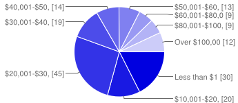
Income of people we surveyed
|
Data Analysis
Now that the demographics have been established, we can begin the analysis.
The major factor that we will use to draw comparisons to is the different modes people are choosing to commute with.
The major factor that we will use to draw comparisons to is the different modes people are choosing to commute with.
|
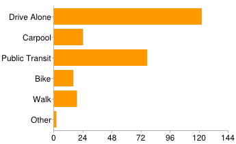
QUESTION: How do you commute to work?
Santa Clara County is a heavy driving county but as noted earlier, we surveyed people at transit centers and thus have an inflated amount of respondents using public transit. This does not reflect the overall situation in the county, but it enables us to draw comparisons between drivers and public transit riders which will be a fundamental of our analysis. |
|
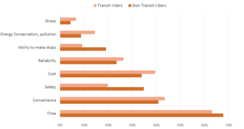
QUESTION: What is most important to you when choosing how you commute? Glancing at the responses we received with this question, it is remarkable to note that the data between transit riders and non transit riders were fairly consistent - they value the same factors. The only exception to this is that safety plays a surprisingly more important factor for non transit riders. The big takeaway of this question is that TIME, not COST is the most important factor for commuters. As a matter of fact, cost is ranked fourth for non-transit riders and third for transit riders. This poses an interesting segue in our analysis. We turn our focus to investigate the question of how people's commute times affect their commute decisions. |
|
Travel Time
|
|
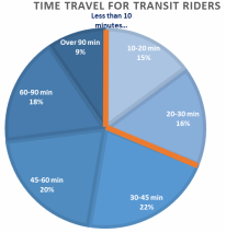
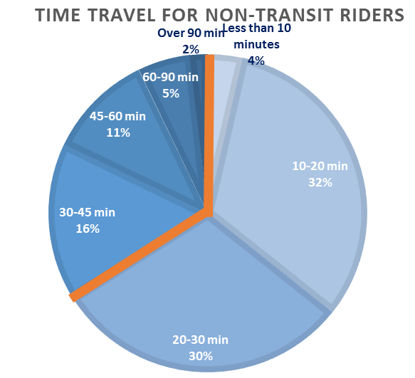
The two graphs on the left show the travel time for transit riders and non-transit riders. The orange line visually separates commutes lasting less than 30 minutes from those requiring more than 30 minutes. The difference between transit riders and non-transit riders is explicit: 67% of non transit riders commute for less than 30 minutes, compared to only 31% of transit riders. More over, the average time of travel for public transit riders is 48 minutes, but only 30 minutes for non-transit riders. This is a big challenge to overcome if we want individuals to switch their modes of preference to public transit. If public transit is to be a viable commute option, it must offer competitive travel times.
|
Income
|
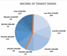
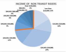
The two graphs on the right show the income brackets of both the transit riders and non-transit riders we surveyed. The orange line visually separates those earning less than $40,000 a year from people earning more. Again, we can see a clear break between transit riders and non-transit riders. People not using transit tend to be lower income, and we can see that a lot of transit riders are actually high income earners - 12% earn more than $100,000 a year. This data suggests that public transit is expensive and does not sufficiently serve low income individuals. One method that could increase ridership amongst lower income individuals, is to provide them with subsidies for transit passes. As we see in the following section, subsidies seem to offer a great incentive for public transit use.
|
|
|
Subsidies
|
|
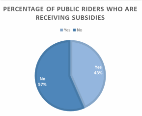
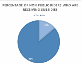
The two charts on the left show the percentage of people receiving subsidies in our transit-riding and non-transit rider populations. We can clearly see that people receiving subsidies are using public transportation at a far greater percentage than those who do not receive them. Another way of seeing this data is to see that 67% of people receiving subsidies are ride transit. Therefore we can infer that subsidies are a strong incentive for people to use public transit. The fact that 43% of people using public transit receive subsidies suggests that financial incentives can have a great effect on public transit use.
|
|
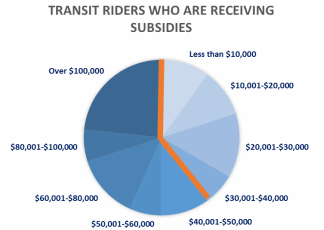
To investigate the subsidy effects further, we looked at the annual income of transit riders who are receiving subsidies. Surprisingly, we found that many higher-income riders are receiving subsidies. You can compare the position of the orange line on this graph to the two income graphs shown above - it is positioned more to the right indicating that there are relatively fewer low income riders receiving subsidies. This mean that benefits are not going primarily to those who need it. Right now, the subsidized pass system works as follows: companies are required to buy passes directly from transit agencies and disburse them to all of their employees. This encourages big companies to buy passes but limits the amount of small businesses willing and able to make that investment for their staff. Further research into the effects of subsidies and how to better improve business-transit cooperation would be a great next step to take.
|
Price Sensitivity
|
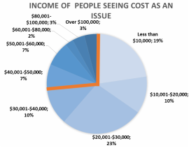
Another thing we wanted to look at was price sensitivity to public transit fares. This chart shows the income of respondents who indicated that cost was in issue either in question 6,7,8 of the survey. Understandably, we see that these respondents who see cost as a barrier to public transit tended to be more low income individuals. However, these figures do not differ remarkably from people not using public transit, which makes a conclusion difficult to make.
|
|
Conclusion
Given our limited resources and time constraints, many factors can be improved to better this project. Given more time, the 191 surveys conducted would have served as merely a sample population, a first iteration of surveys. We also found some limitations to our analysis due to various factors including but not limited to: the number of responses, the phrasing of questions, data collection methods, and tracking. Nonetheless, given the data we were able to collect and analyze, we found evidence of strong patterns that deserve attention. In particular, time is clearly a important factor that an integrated fare system must acknowledge. An integrated operating schedule that attempts to eliminate transfer wait times with efficiency and coordination is an important tool that can help garner public support for an integrated fare system across the Bay. We were also able to note that subsidies provided a strong incentive towards the use of public transit. Moreover, that subsidies disproportionately flow to higher-income individuals was really surprising and a really interesting question to investigate.
